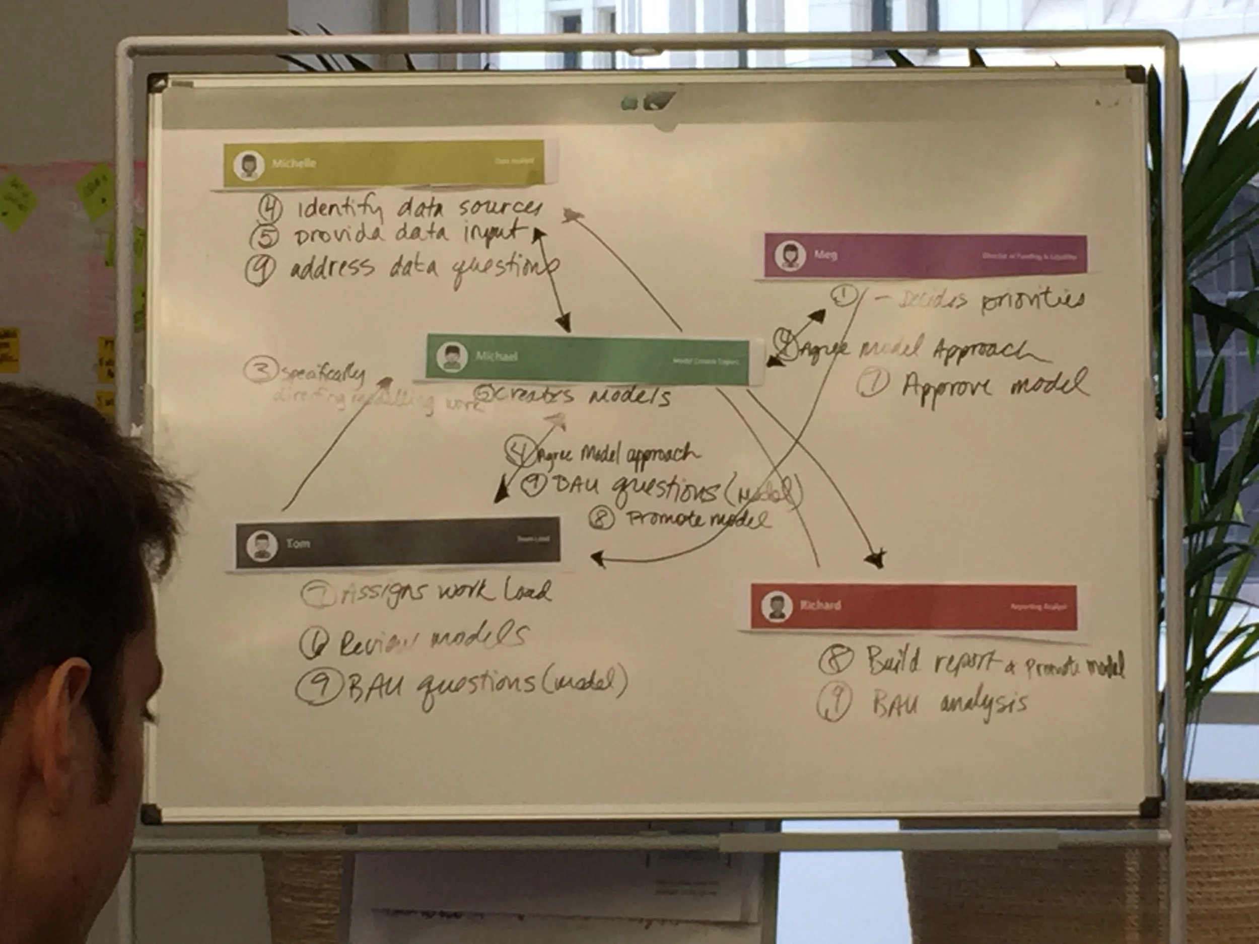
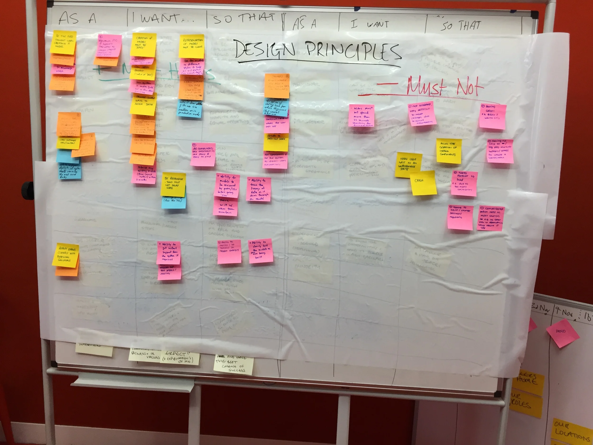
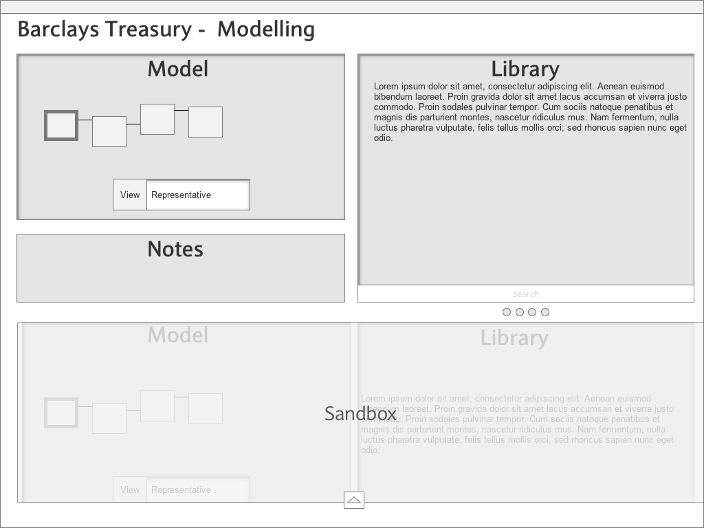
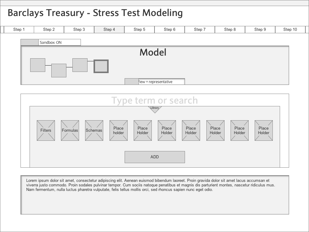
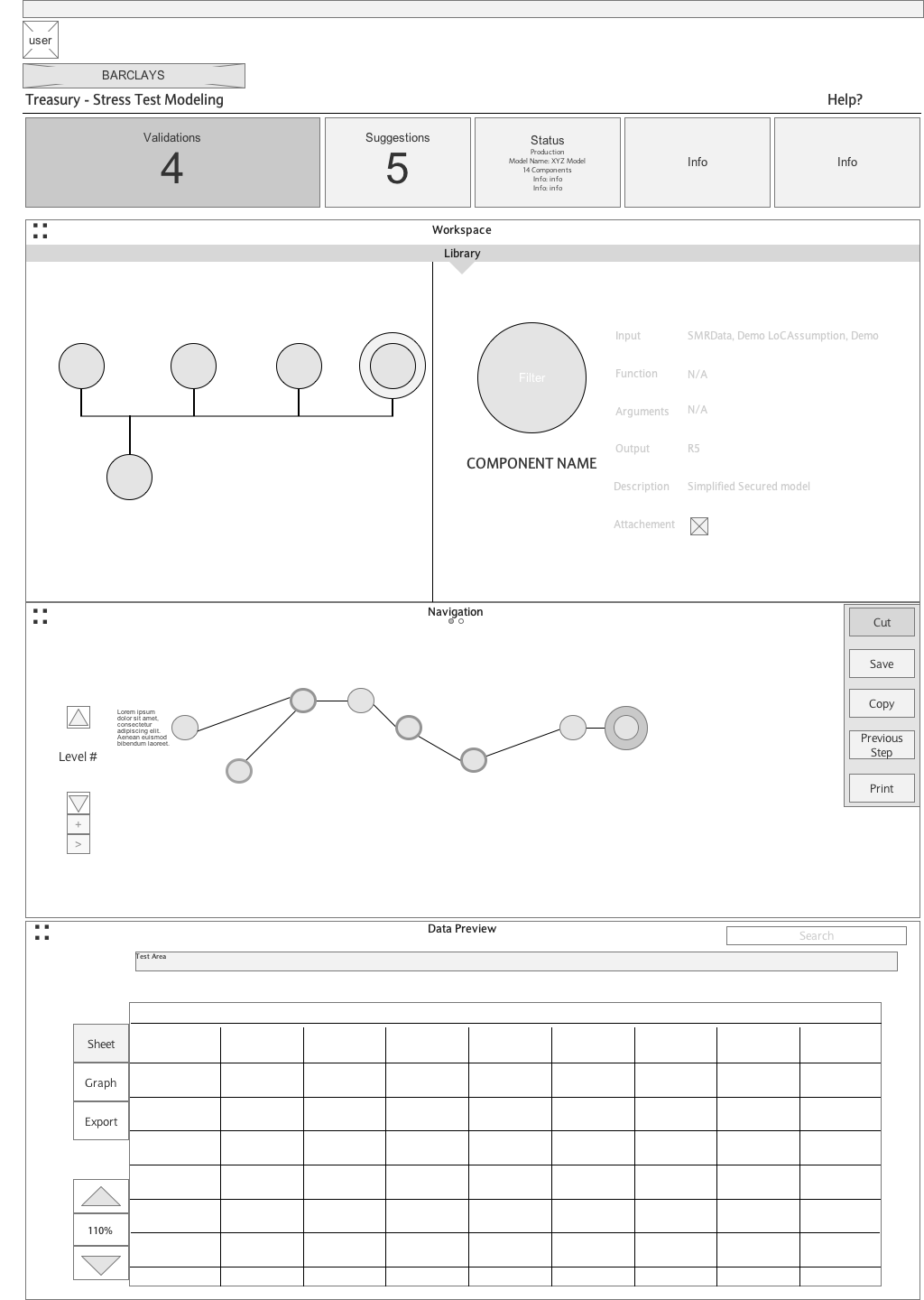
Problem:
Current implementation of BMB app is not fluid in use, lacks visual clarity, and cannot be translated across platforms with ease. This leaves the user feeling confused and frustrated.
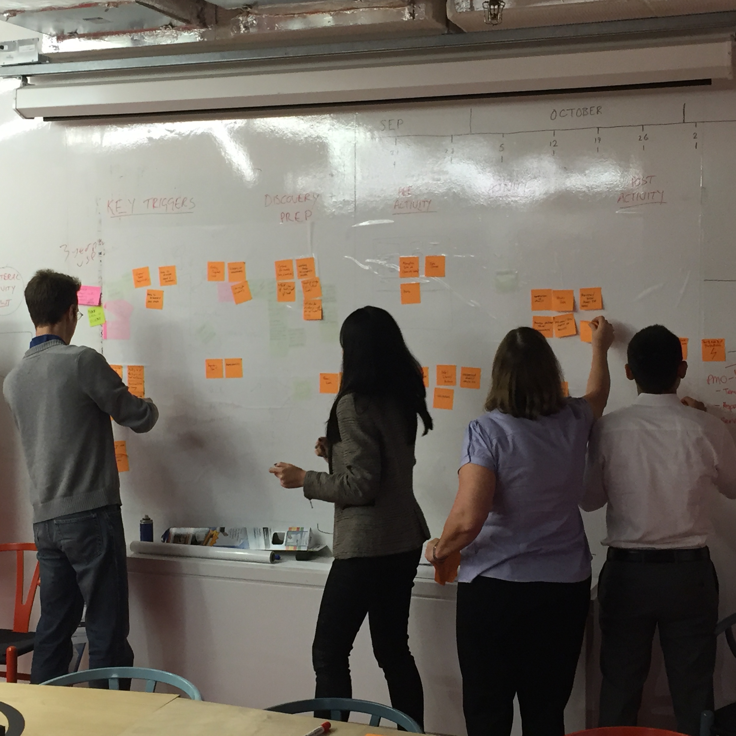
Plan:
Simplify the design, revisit iconography, bring in new and intuitive elements, research what is most important to the users, help the process to be more intuitive.
A study was performed in order to better understand how users view and comprehend icons. The knowledge acquired will help my team design and assign icons to correctly communicate to the user what they are viewing and how to use Barclays' apps more fluidly.
Measuring the effectiveness of the existing vs. the alternate icon set had profound results. Subjects were 12% more successful in placing the alternate icons versus the existing icons when measuring comparative icon set only. The difference became more pronounced when removing outliers widening this gap to 14%.
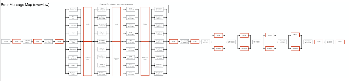
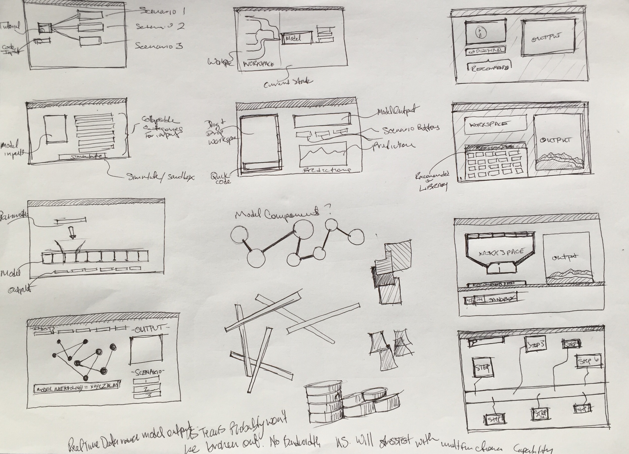
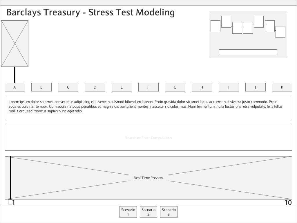
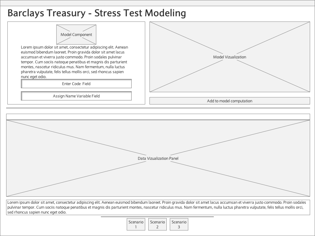
The best wireframes and concepts start from simple paper and pencil brainstorming then move onto the screen. My team was able to bounce concepts and ideas across time zones to create a strong design concept and a logical user experience.